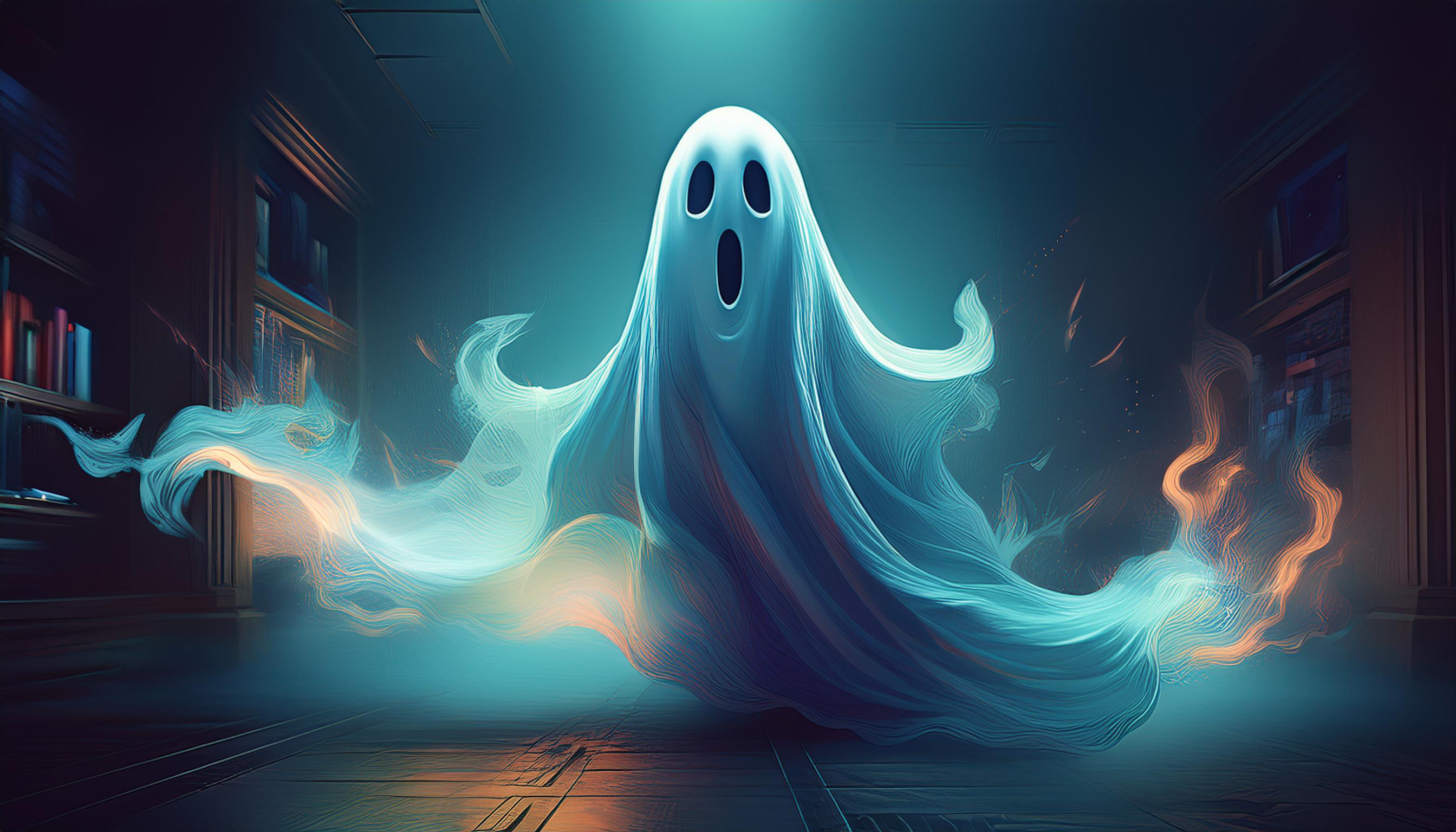
Ever clicked onto a website, only to feel lost, frustrated, or downright haunted by its clunky design? You know, the type where buttons seem to lead to nowhere, images are all over the place, and you find yourself wondering how you even got there in the first place?
Welcome to the spooky side of web design—where ghosts aren’t the only thing scaring away visitors!
Let’s dive into the haunted state of poor website design and explore what spooky elements might be lurking on your own site. After all, you don’t want your customers fleeing in fear, right?
Ghostly Traits of a Bad Website
A website might not have literal ghosts, but some elements can be just as terrifying for visitors. Here are the ghoulish traits that make users scream (and not in a good way):
1. Cluttered Layouts: Like stepping into a room packed with cobwebs, a cluttered website is hard to navigate. Overloaded pages filled with banners, pop-ups, and walls of text make it difficult for users to focus on what really matters—your product! Visitors shouldn't have to sift through endless distractions just to find what they’re looking for.
2. The Navigation Nightmare: Ever felt like you’re trapped in a maze with no way out? That’s what poor navigation does to your site. Confusing menus, hidden links, or unpredictable page paths leave users frustrated and eager to leave. No one wants to click a button and end up in an unexpected (and unwanted) part of your site.
3. Slow Loading Times (The Ultimate Jump Scare): Imagine waiting forever for a page to load! Slow websites are like horror movie jump scares that make people run... straight to your competitors. If your website takes more than three seconds to load, you’re waving goodbye to over half of your potential customers.
4. Mysterious Missing CTAs: Your website should guide users to take action, whether it’s “Buy Now,” “Contact Us,” or “Sign Up.” If your call-to-action buttons are nowhere to be found—or worse, hidden away—then it’s like inviting someone to a Halloween party but forgetting to tell them where it is. Result? No party, no fun, and no customers.
5. Inconsistent Design (A Frankenstein Creation): A website that looks like a patchwork of fonts, colours, and mismatched design elements is bound to scare away visitors. If your pages look like they were thrown together in the dark, it’s time to stitch them back into a cohesive, user-friendly experience.
The Horror of eCommerce Websites
For eCommerce sites, these ghostly design issues can haunt your sales. Imagine a customer ready to purchase, but the "Buy Now" button is hard to find, or worse, the page crashes just before they complete their order.
Talk about a nightmare! If your site isn’t optimised for smooth shopping experiences, you could be missing out on major sales, leaving your customers running for the hills.
How to Banish the Ghosts from Your Website
Now that we’ve identified the things that go bump in the night (aka bad website traits), it’s time to exorcise those website demons. Here are some actionable tips to help you simplify, streamline, and save your website from the horrors of poor design:
1. Simplify Your Layout: Stick to a clean, easy-to-follow design. Less is more! Make sure your pages have clear focal points that draw users in, rather than overwhelming them with too much at once.
2. Fix Your Navigation: Make sure users can find what they need without having to go on a treasure hunt. Create clear menus and easy paths back to the homepage. Remember, good navigation is like leaving breadcrumbs for your visitors—simple, clear, and effective.
3. Speed Things Up: Use tools like Google PageSpeed Insights to see how fast (or slow) your website is and where you can make improvements. Compress images, minimise scripts, and make sure your server can handle traffic without slowing down.
4. Visible CTAs = More Sales: Place your CTAs prominently and use action-driven language like “Shop Now” or “Claim Your Offer.” Make sure they stand out visually, guiding your users to the next step in their journey.
5. Keep It Consistent: Stick to a colour palette, font scheme, and layout style across your entire site. This makes the user experience seamless and pleasant, rather than chaotic.
Call Surge – Your Website Ghostbusters!
Don’t let a haunted website scare away your customers. If you’re dealing with slow load times, confusing navigation, or a cluttered design, it’s time to bring in the pros.
At Surge, we’re experts at removing the ghosts haunting your website and turning it into a user-friendly, lead-converting dream.
So, who you gonna call? Not Ghostbusters—Surge!
Get in touch today to banish those website nightmares for good.